Deviation Actions


Description
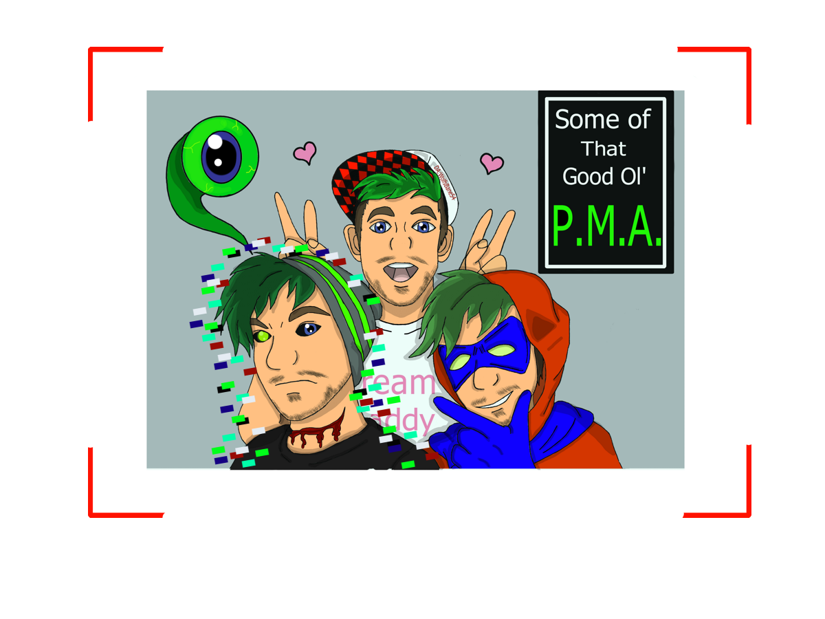
Chase: Come on, Anti!! Show us a smile!!
Jackieboy Man: This is my good side.
Anti: *Just snap the photo.*
I decided to actually put glitch effects on Anti.
wolfsbane54.deviantart.com/art…
Any advice on how i can make my digital art better would great. I'm still sort of new to it and still playing around with all the colors and tools at my disposal.
I do like the photo snap effect you got going on around the picture. It’s like the targeting (or guiding) that cameras have to help them center a picture together. Usually there’s a + in the middle, and I think this would have been neat to have, but it’s not necessary as you would have had a rather red mark over the face of one of your characters.
The coloring of this is really nice. You’re within your lines, and your lines look nice and solid. The posture for the character in the back looks rather nice, and you’ve done well to work on your strengths. The one with the hood looks rather relaxed, so does the other one. Neither of your characters look too rigid which is great.
Some areas you could work on are the hands. I like how you hid the peace (or rabbit ears) behind the two character’s heads. But the hands look a bit too large , especially the hooded/masked character up front. Try using reference photos of hand to head comparisons to help you on that part. The shading of the hair looks nice, but appears a bit too dark. Maybe try using highlights on them to help them pop out, and darker colors of a different shade of green so it doesn't look flat.
The pixel effects around the character look nice, but don’t give that glitchy effect. However I would try looking up a tutorial on this, or other pictures that use a distorted glitch effect in them. In some references, it looks like they took rectangular long sections from the character and shifted them a bit, like this one here. with some distortion thrown in. Experiment on this till you get the effect your looking for. ![]()
Overall you’ve done a great job on this picture. I like how the characters are centered, and their expressions overall seem to give us a good idea on the character’s personality without us even knowing them. We can see whose enjoying the photo op, and who’s not. Two to one it’s the guy that’s glitching out that’s not having fun- just my guess. The white border gives that picture feel to it, and the background doesn’t detract from the main characters.
Keep up the good work.